It’s probably a sacrilege to write this after posting about affogato, espresso drinks, and fine Italian coffee.
But, regardless of personal tastes, the original Starbucks on 1912 Pike Place is a major tourist attraction. Even in the evening when we arrived (as the market was closing), there were still flurries of tourists hanging around and taking pictures (as you can see in the reflection below).
Who knew in 1971 that this little independent coffee shop would become the king of identity branding? Certainly no one considered the original mermaid logo complete with boobies and double tail the stuff of legend.
However, over the years the company had handled its brand with remarkable precision. This month (March 2011), they’ve removed the text that wraps the mermaid image for their 40th Anniversary. They no longer need to spell out where the coffee comes from.
The one thing that I will be watching for is how long it will take Starbucks to roll out the new brand materials worldwide. Did they send out the new materials ahead of time to release the same day, or will they change after old materials run out, or maybe have both run together?
I also want to see how long it takes for Calgary to get the new branded look. Any guesses on how long?
Not sure how this rumour evolved over the years, but, the Starbucks name (1971) was not taken from Starbuck from Battlestar Galactica (1978). Seattle is a seafaring town and to honour their maritime heritage, the original founders named the shop after “Starbuck” the Quaker first mate of the Pequod in Moby Dick.
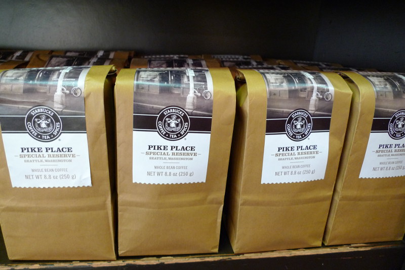
The original store only sells one type of coffee that I could see… a Pike Place “Special Reserve” roast in 1/4 pound bags.
