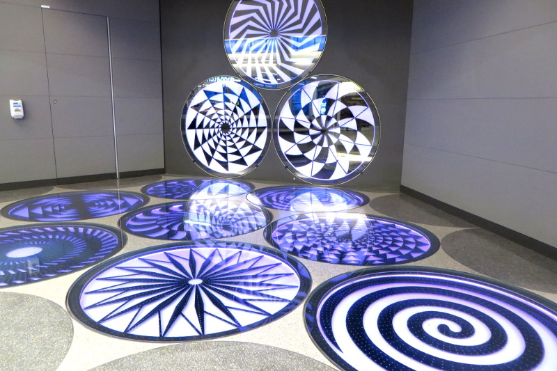
It’s not often that I write about airports… to me they are something to pass through quickly; however, the changes made to San Francisco’s United Terminal (T3) are eye-popping and have transported the dingy, dark, dirty hallways into the future.
At one point as I meandered down a pristine white walkway, two cleaners were trying to figure out how to remove rubber marks left by someone’s luggage on the floor. The black seemed completely out of place in the futuristic-white environment. This is too much for me to scrub and polish, complained one cleaner who proposed they put the mop away and pull out a machine.
Cleanliness aside, the improvements draw you in with interactive maps that allow readers to learn about the airport and history of San Francisco, food that people with allergies can eat (and doesn’t cost triple what you’d pay elsewhere), plenty of computer stations with charging docks and space, friendly lighting, ergonomic designer seating, bathrooms that I wanted to use, 23-foot-tall windows that showcase planes taking off, and a yoga studio.
The T3 improvements became available to the public on Tuesday (Feb 4) and cost an estimated $138 million. The great news is there’s more to come including a security area upgrade that will please frequent fliers who tolerate the existing abysmal experience weekly.
